Build your brand.
A look at the identities we’ve crafted for businesses ranging from cultural organizations to private studios, each designed to stand out and feel true to who they are.
project objective
rockwell industries
This project was for a private tattoo studio that wanted a clean, space-themed identity with a modern feel. The goal was to avoid the typical tattoo shop look and create something that felt exclusive, artistic, and a little mysterious. The final design combines subtle cosmic elements with a bold simplicity, tied together by the client’s tagline: Classy as Fuck.
deliverable showcase
The final package included the primary logo in multiple formats for both print and digital use, ensuring full versatility across platforms. We also created an animated version of the logo designed for use in social media, promotional videos, and visual branding, giving the studio a sleek and dynamic touch that reflects its creative edge.
project objective
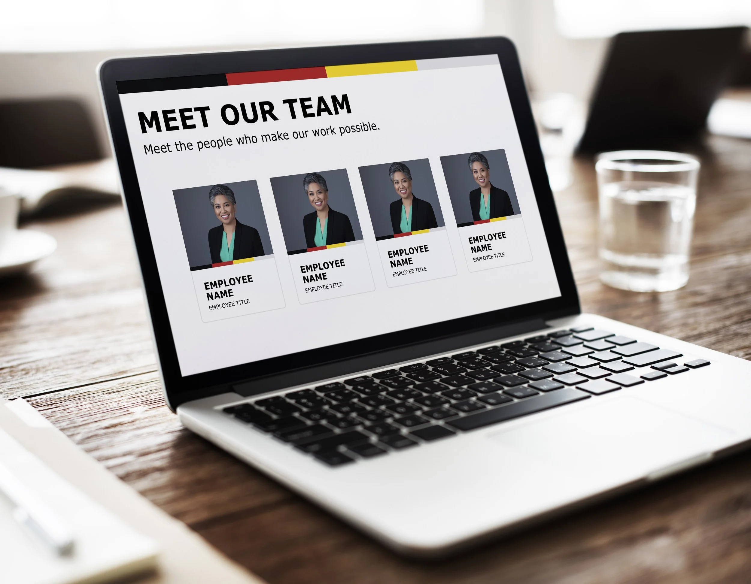
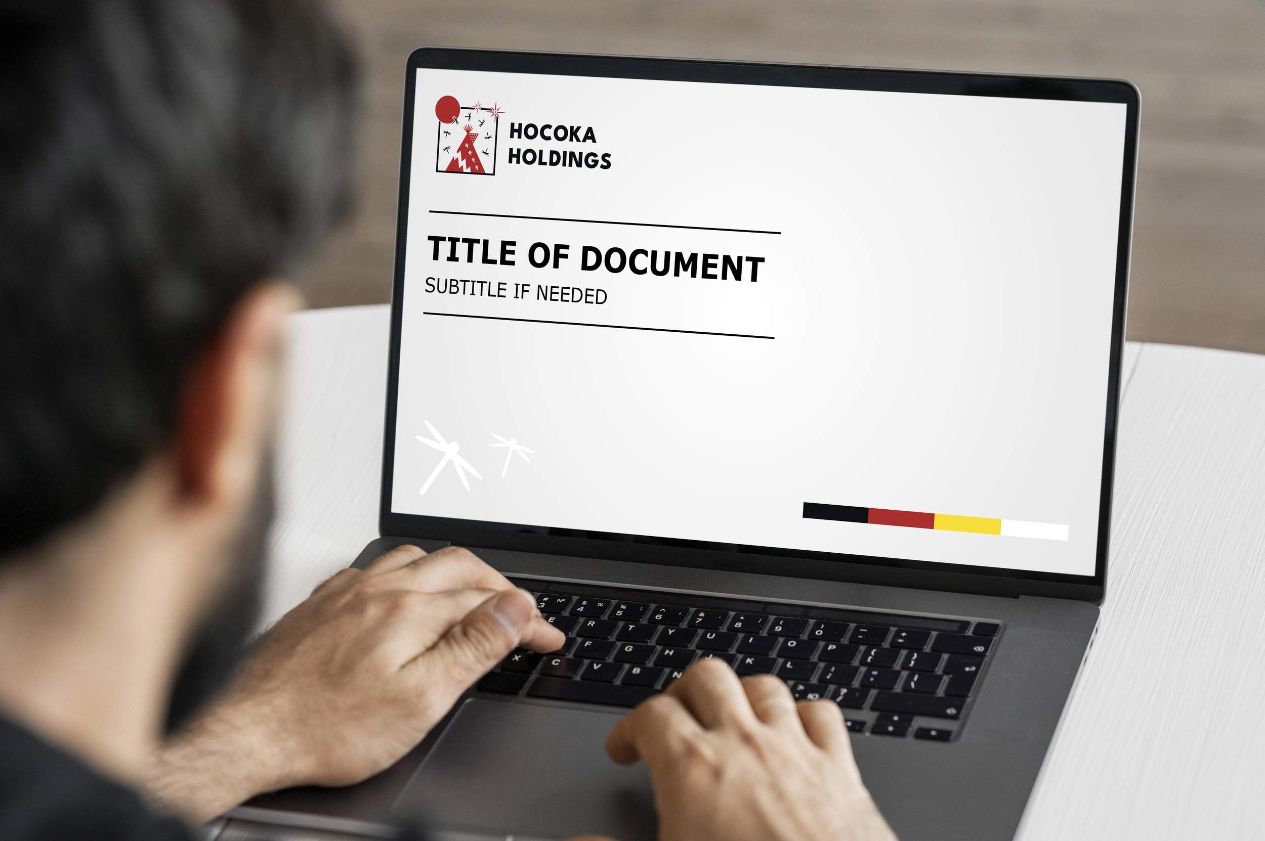
hocoka holdings
Hocoka Holdings needed a cohesive visual system that worked seamlessly across corporate materials and digital platforms. Our goal was to create a professional yet approachable brand presence that would carry through every client touchpoint.
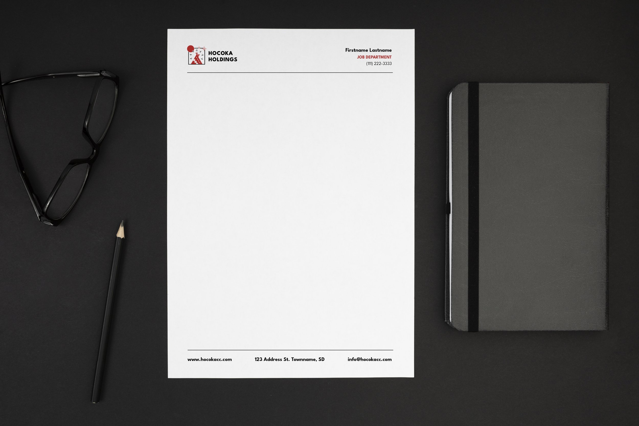
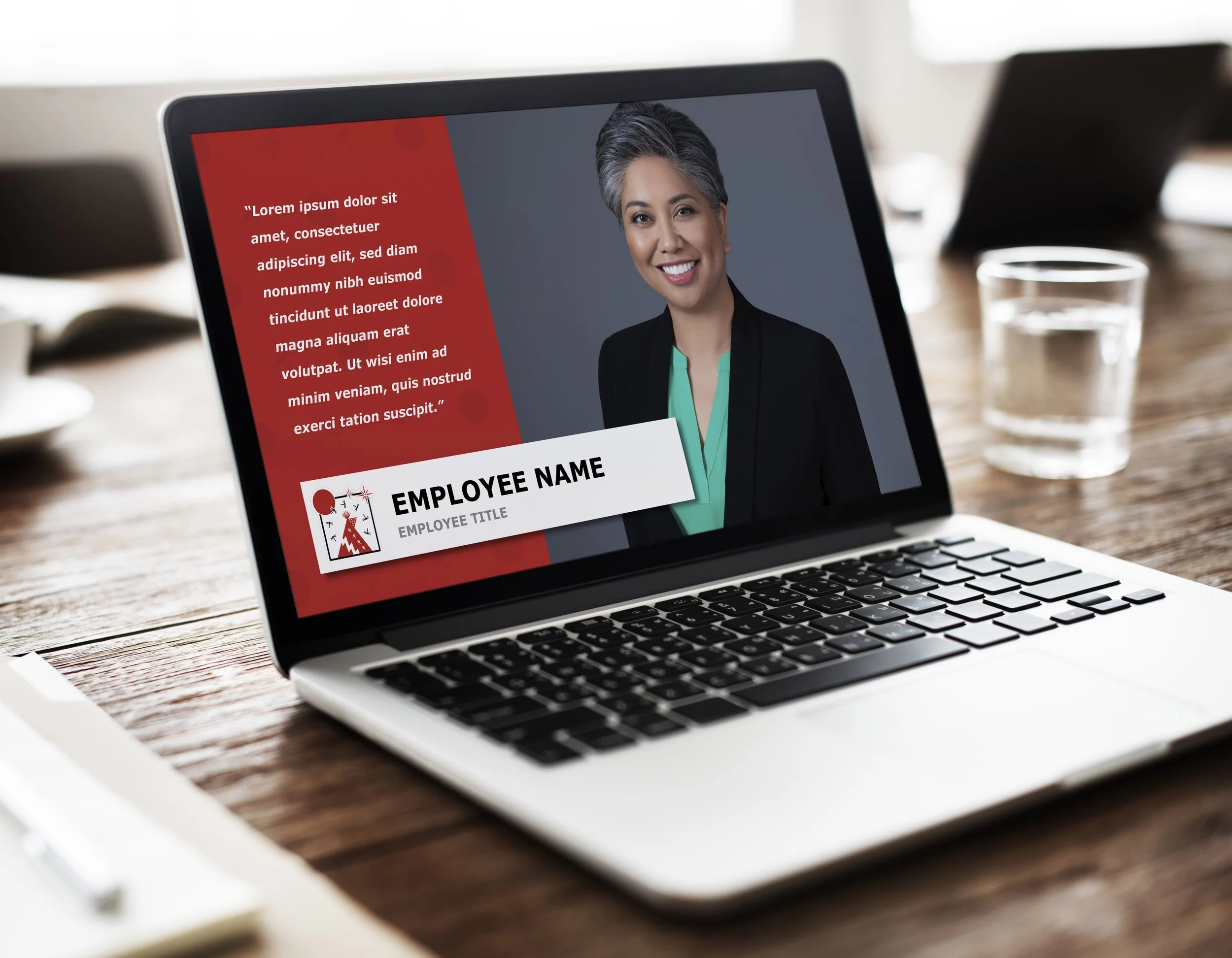
Deliverable showcase
A full brand system rollout: letterhead and PowerPoint templates, social and virtual backgrounds, and all logo formats ready for web and print.
Each asset was optimized and delivered in every file type needed for practical, real-world use.


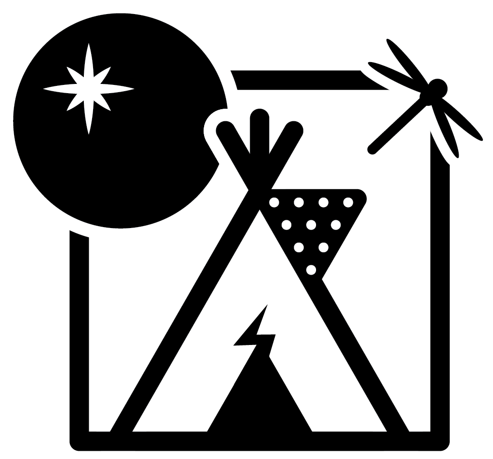
logo design process
Every brand mark starts with exploration. We refined Hocoka’s logo through stages of research, sketching, and digital experimentation, balancing their vision with clean, modern design principles. Each iteration brought us closer to a mark that felt confident, timeless, and professional.
client sketches
The client shared a few hand-drawn logo sketches to capture their initial vision. We used those ideas as a base, refining the forms, typography, and balance to create a clean, cohesive mark that could represent the brand professionally.


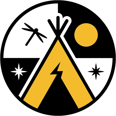
concept exploration
Before landing on the final logo, we explored several design directions that expanded on Hocoka’s initial ideas. These versions highlight different takes on composition, typography, and symbolism, offering a glimpse into how the brand could evolve visually.